bytemunchdotdev slashblog
theme toggle
Movie Snacks!
A new site for a new business.
19/06/2023
My brother asked me to whip up a website for his new snack creation and distribution business.
Designing for a theme
I've decided to theme the site after a cinema screen, in-keeping with the movie aesthetic. Content will appear on a scrollable projector screen, with curtains at the edges and a wall behind, perhaps with seats in front if there's screen real estate. It might be interesting to add a little flicker or film grain to the content, but it could also be distracting or irritating. I'll test that idea out once I've got the meat of the site blocked out.
Font forging
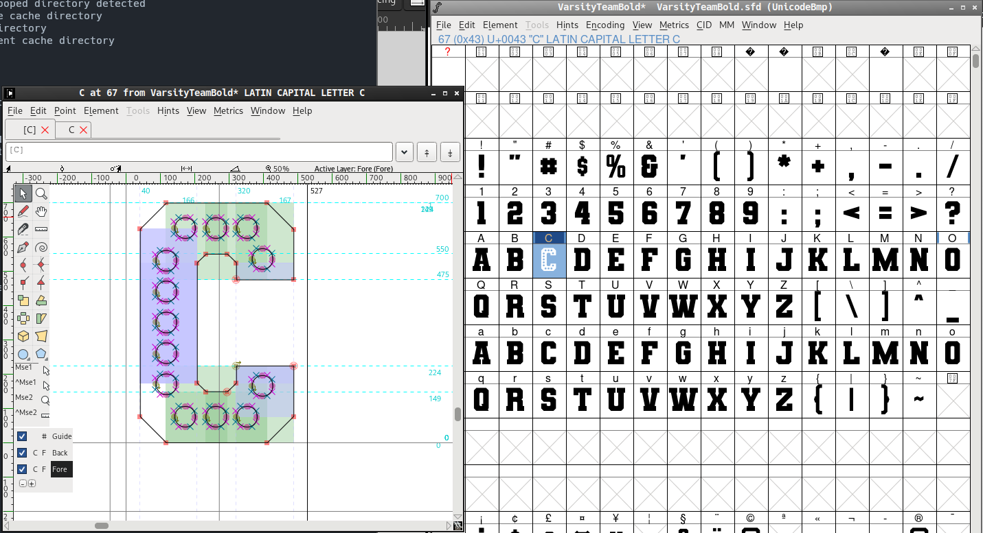
With the logo, I'd like to try out the old cinema light lettering style. I've found a "100% free" varsity font on DaFont, and I'm learning how to add cut-outs for the lights. To accomplish this I've installed FontForge
I'm going to go through and laboriously cut lights out of the capital letters. Learning new software is fun, right?

Holey Font
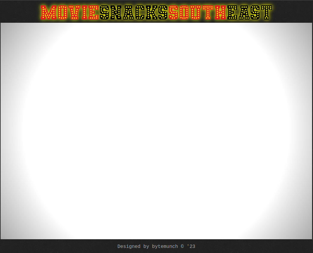
Now I've got holes in the font, I'll add it to the site. With a drop shadow repurposed as a glow and solid characters behind the holey ones we get an okay facsimile of lit up text.
certainly gaudy but that could be a vibe to pursue
The projector
I've put a background image from transparent textures to make the backdrop look more like a wall. For the screen I've simply added a scrollable div with a radial gradient background.

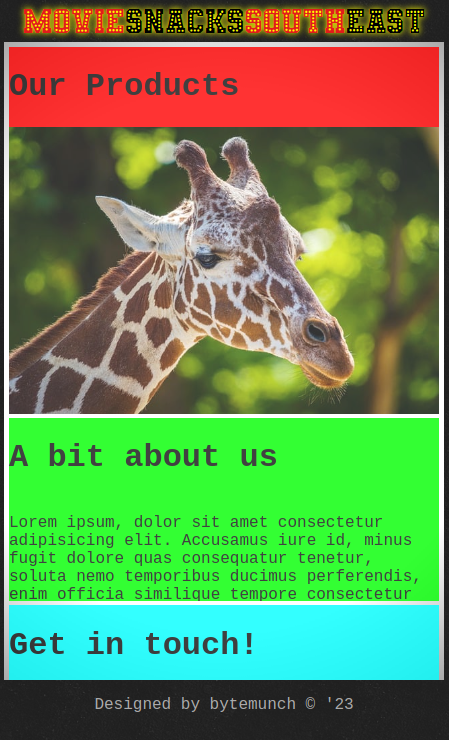
Then I threw a nice asymmetrical grid up on it with a touch of transparency.
don't mind the giraffe, first image I found on pixabay
All content is put in the screen div with eleventy, and it feels good to scroll. The whole thing is of course responsive, mobile first, but unfortunately I'm not able to push the cinema aesthetic as clearly as on desktop. I think I might need to play with the font sizing on smaller displays too.

Now I just need the content for the site. Once my brother gets back to me I'll continue on this project.